Publicly Available Content
The content of this page has been made publicly available to assist all members of the profession.
Read time: 26 minutes
Introduction
Good design considers the needs of all users, including people who are blind or have low vision. People with low vision cannot correct their eyesight with glasses, contact lenses, medication, or surgery. Low vision can affect people of all ages and can be caused by injury, by medical conditions such as macular degeneration, glaucoma, diabetic retinopathy, or by genetic conditions such as retinal dystrophies like retinitis pigmentosa. The number of people affected by low vision increases with age, ie 18% in people aged 65 and older compared to 6% in people under age 65, as the incidence of disease is greater.
Page contents
Low vision can have an impact on activities of daily living. It can make it difficult to understand the world around them, to recognise faces, to read street and building signs, and people may find that lights do not seem as bright, or they may be sensitive to glare.
Very few people are totally blind. These few must rely on tactility and sound messaging for independent orientation and wayfinding. Most people with a discernible sight disability have sufficient vision to distinguish between light and shade. This ability is used in the application of luminance contrast. The following images show examples of how people with vision impairment may experience their environment.
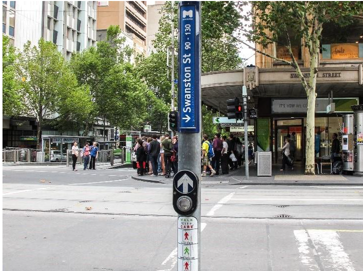 Normal Vision
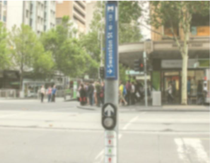 Cataracts
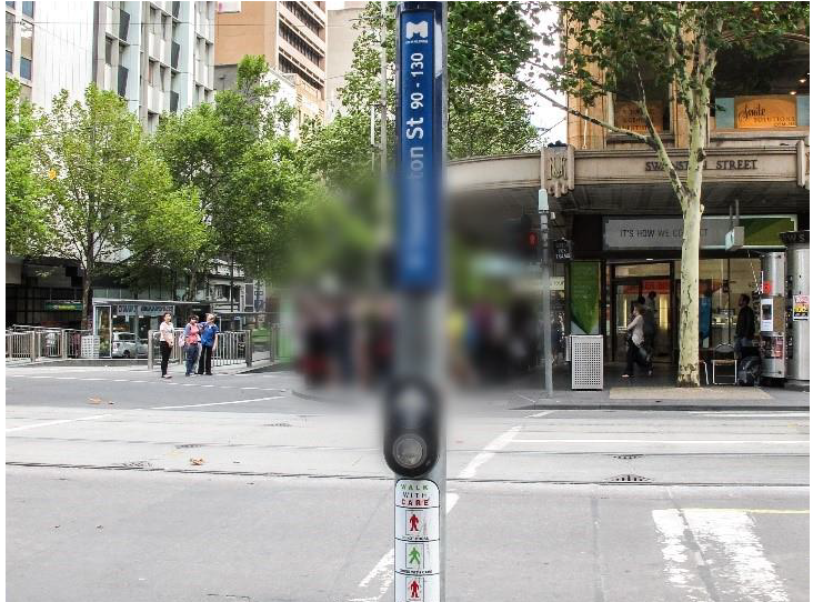 Age-related macular degeneration (early)
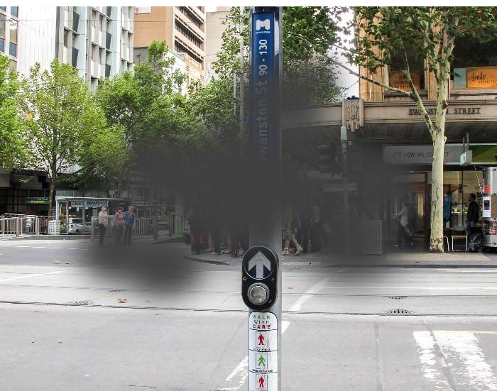 Age-related macular degeneration
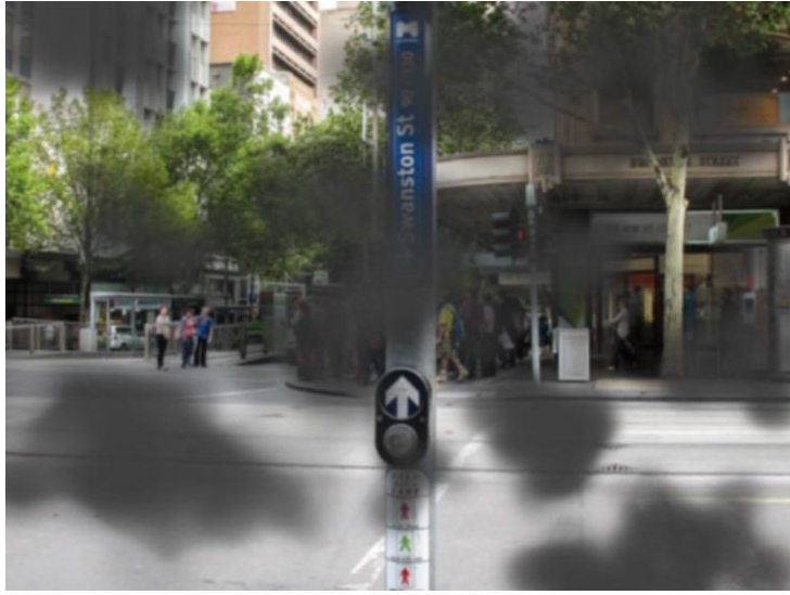 Diabetic retinopathy
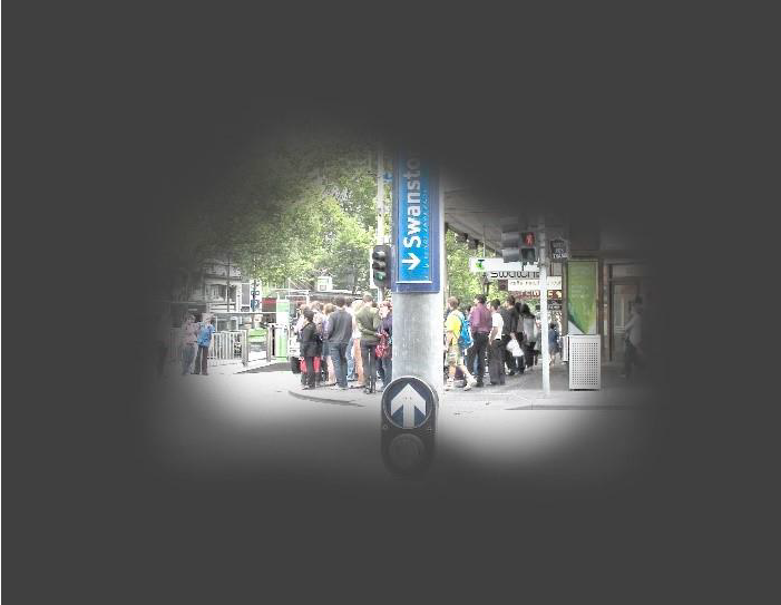 Glaucoma
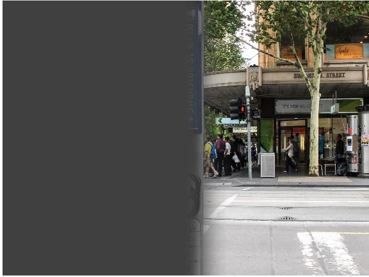 Stroke (left hemianopia)
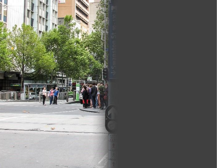
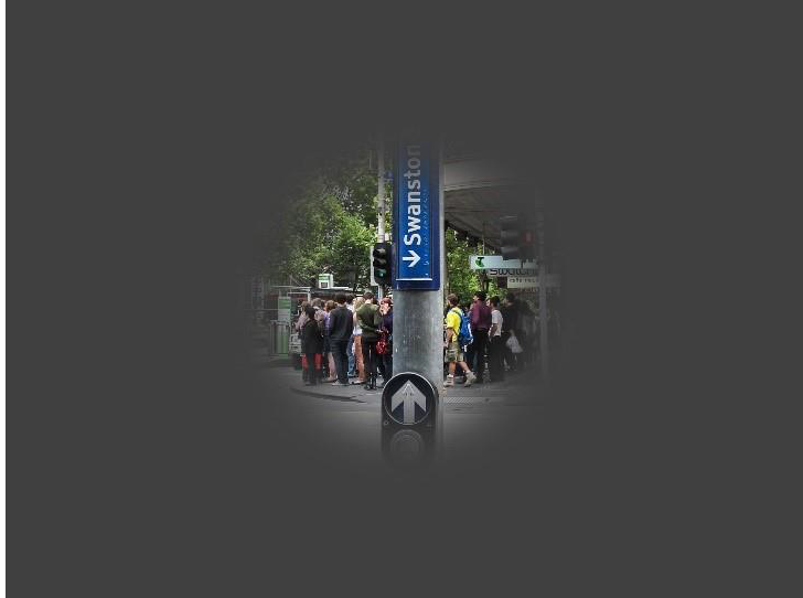 Retinitis pigmentosa
 Total blindness (rare)
Reviewed by Virginia McDonald, Clinical Development Lead-Orthoptist, Vision Australia, Kooyong Office. Images: Frances Davenport with graphics by Ria Davenport)
Australian States and Territories adopt the National Construction Code (NCC) which includes minimum technical requirements for buildings. There are additional requirements in the Federal Disability Discrimination Act (DDA). The DDA mirrors parts of the NCC but has broader application as it covers discrimination.
Provision of the mandated minimum requirements does not guarantee that the needs of all users will be met. A good wayfinding system is also necessary to create a legible and usable space that can be safely navigated.
This design guide provides an outline of the NCC mandated minimum provisions. It also includes recommendations for best practice design solutions to make facilities and premises safer and less discriminatory for people who are blind or have low vision. Lastly, the importance of design for people with vision impairment is shown by a successful DDA case regarding a $1.8bn hospital.
Mandated NCC provisions
The NCC is a performance-based code with mandatory minimum Performance Requirements that can be met either by a Deemed-to-Satisfy (DTS) Solution, a Performance Solution, or a combination of solutions. The main Performance Requirements for designing for vision impairment are D1P1 Access for people with a disability and D1P2 Safe movement to and within a building. This confirms that design for vision impairment also enhances safety for everyone.
For NCC 2022 Amendment 2, the DTS provisions reference the following documents:
- AS1428.1–2021 Design for access and mobility – General requirements for access – New building work
- AS1428.2–1992 Design for access and mobility – Enhanced and additional requirements – Buildings and facilities (Note: Applicable to transport buildings only)
- AS1428.4–1992 Design for access and mobility – Tactile ground surface indicators for the orientation of people with vision impairment (Note: Applicable to transport buildings only)
- AS1428.4.1:2009 Design for access and mobility – Means to assist the orientation of people with vision impairment - Tactile ground surface indicators (incorporating amendments 1 and 2)
- AS1735.12–1999 Lifts, escalators and moving walks – Facilities for persons with disabilities (incorporating amendment 1)
Note
The mandated minimum requirements described below, relate to the DTS provisions and the relevant NCC referenced documents.
- There may be state and territory variations to the NCC provisions.
- AS 1428.1:2021, which provides clarifications of AS 1428.1–2009, is not currently referenced by the DTS Provisions but may be used in a Performance Solution.
Luminance contrast
Luminance contrast means the light reflected from one surface or component compared to that from another adjacent surface or component.
A common application of luminance contrast is in the legibility of text. If there is minimal luminance contrast between the text and its background, the text may be invisible to a reader with vision impairment.
In the NCC, luminance contrast of 30% minimum between adjacent building elements is required to assist people with low vision in identifying doorways, obstacles that abut an accessway, and other objects such as stair treads (see below), toilet seats, lift and door control buttons, glazing and required signs. Required signs include those identifying fire exits, accessible WCs and hearing augmentation. For tactile ground surface indicators (TGSIs), there are different requirements depending on the TGSI type – see below.
Luminance contrast of other features can contribute to best practice design and is covered in the next section.
Applicable NCC clauses and standards:
- NCC 2022 Volume One Performance Requirements D1P1 Access for people with a disability and D1P2 Safe movement to and within a building. DTS provisions: Specification 15 Clause S15C4, E3D7, Part F4D5(e), Specification F27, Part I2
- AS 1428.1:2021 Sections 3.6, 8.1 (f)(g), 10.1
- AS 1428.1:2021 Appendix B (informative) - Measurement of luminance contrast between building elements
- AS 1735.12-1999: Clause 8
Examples of NCC compliant practice
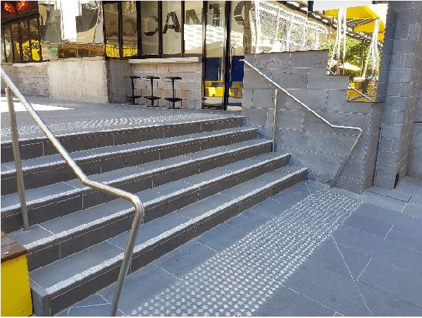 Contrasting nosing strips and TGSIs.
(Image: Helen Fearn-Wannan)
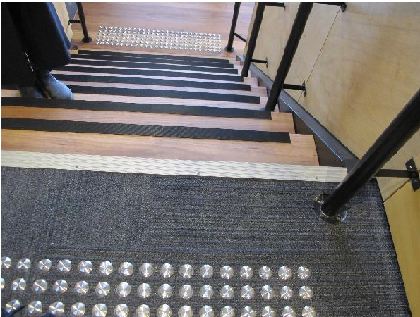 Contrasting nosing strips and TGSIs. (Image: Francesca Davenport)
Raised tactile and Braille signage
Signage systems that accommodate most users incorporate raised text and Braille (RTB) characters and/or symbols. RTB signs assist people who are legally blind; symbols and/or pictograms assist people with cognitive disabilities and people with dementia; simple language within signs assists people with cognitive disabilities and people from culturally and linguistically diverse communities.
RTB signs are required by the NCC to identify and to provide direction to sanitary facilities, spaces with hearing augmentation systems, required exits, lift control buttons on landings and within lift cars.
RTB signage must be installed at the specified height and location. The sign background or its border must have a minimum of 30% luminance contrast with the wall or surface upon which it is mounted, and the signage characters and text must contrast with that background.
Applicable NCC clauses and standards:
- NCC 2022 Amendment 2 Volume One Performance Requirements D1P1 Access for people with a disability and D1P2 Safe movement to and within a building. DTS provisions: Clause D3D26(2)(b), Clause D4D7(1)(a), Specification 15, Clause E3D8(j), Specification S27C9(j), Specification S27C10
- AS 1428.1:2021 Section 5 Signage
Visual indicators on glazing (decals)
Visual indicators on glazing are required to prevent people with low vision from colliding into glazing that can be mistaken for a doorway or opening.
Contrasting strip dimensions shall be not less than 75 mm wide and must extend across the full width of the glazing panel. The contrasting line shall be positioned between 900 mm and 1000 mm above floor level to the underside of the line.
The visual indicator requires a solid and non-transparent line with 30% luminance contrast when viewed against the floor surface. This applies to viewing through both sides of the glazing. This may be challenging for external doors where there may be high daylight levels externally as compared to a darker interior. It is also difficult to achieve when viewed against a busy background.
The opacity of the line shall be tested by observing a solid object placed immediately behind and touching the glass. The line is considered opaque if no image of the object is visible.
Applicable NCC clauses and standards:
- NCC 2022 Amendment 2 Volume One Performance Requirements D1P1 Access for people with a disability and D1P2 Safe movement to and within a building. DTS provisions: Clause B1P3(c)
- AS 1428.1:2021 Section 3.6 – Visual indicators on glazing
- AS 1288:2021 Glass in buildings – Selection and installation, Section 5 – Criteria for human impact safety
Examples of non-compliant practice
 Non compliant visual indicator strip does not provide adequate contrast with the floor in the background.
(Image: Penny Galbraith)
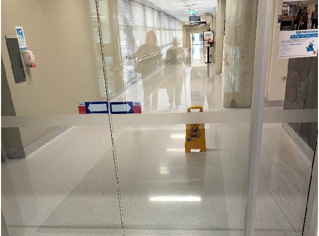 Visual indicator strip does not provide adequatecontrast with the floor in the background.
(Image: Penny Galbraith, adapted by Francesca Davenport)
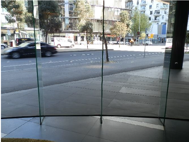 The hazard warning decals are barely perceptible in this glazed wall.
(Image: Penny Galbraith)
Examples of NCC compliant practice
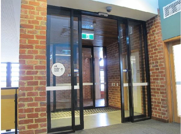 NCC-compliant visual indicators on glazing.
(Image: Francesca Davenport)
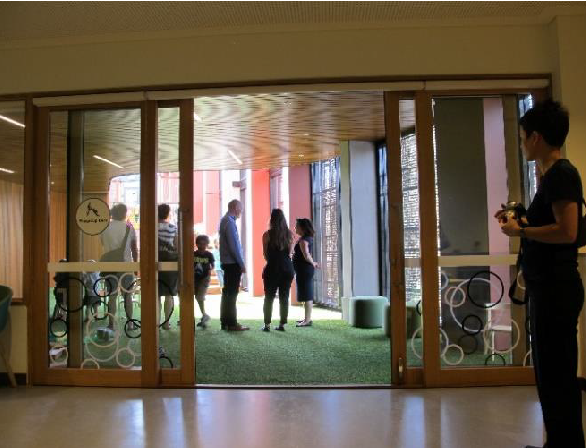 NCC-compliant visual indicators on glazing. (Image: Francesca Davenport)
NOTE
Refer to section on Best practice for recommended visual indicators on glazing.
Tactile ground surface indicators (TGSIs)
TGSIs must be provided to warn people who are blind or have low vision that they are approaching a hazard such as:
- a stairway
- an escalator, passenger conveyor or moving walkway
- a ramp
- an overhead obstruction of less than 2 m above floor level (other than a doorway)
- an accessway meeting a vehicular way adjacent to any pedestrian entrance to a building if there is no kerb or kerb ramp at that point.
TGSIs are required to be located at a certain distance, ie 300 mm, from the hazard to provide users with consistent and adequate warning of the location of the hazard.
Correct placement of TGSIs also provides guidance to the correct and safe direction of travel, ie perpendicular to the long side of the strip of TGSIs. A curved strip of TGSIs provides warning of hazard but does not clearly indicate the safe direction of travel.
Luminance contrast is required between the indicators and the base surface, ie 30% for integrated TGSIs; 45% for discrete TGSIs; and 60% for composite TGSIs.
NOTE
The NCC does not require TGSIs for fire-isolated stairways or ramps and there are also concessions for Class 9c aged care buildings.
Applicable NCC clauses and standards:
- NCC 2022 Amendment 2 Volume One Performance Requirements D1P1 Access for people with a disability and D1P2 Safe movement to and within a building. DTS provisions: Clause D4.D9, Clause I2D11
- AS 1428. 4:1992 (for transport buildings only)
- AS/NZS 1428.4.1:2009
- AS 1428.2-1992 Clause 18.1 (for transport buildings only)
Examples of non-compliant practice
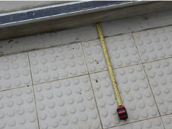 Integrated TGSIs incorrectly positionsed (i.e. less than 300 mm from the stair tread); no lumnince contrast with the background.
(Image: Penny Galbraith)
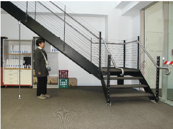 A reduced height (less than 2m) under the stairs is a hazard; suitable barriers or hazard TGSIs have not been provided.
(Image: Francesca Davenport)
Examples of compliant application
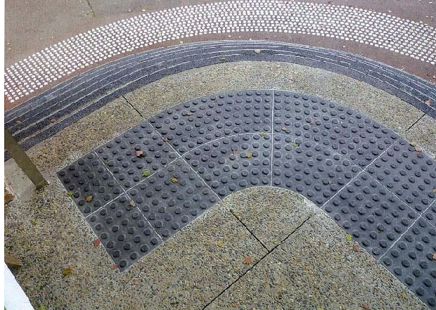 Custom integrated granite TGSIs
(Image: Francesca Davenport)
This photo shows compliant custom integrated granite TGSIs at the top of a refurbished heritage curved entrance steps. Safe directions of travel are perpendicular to the straight edges.
Note: a curved strip of TGSIs provides warning of hazard but does not clearly indicate the safe direction of travel. Therefore avoid curved steps in new designs.
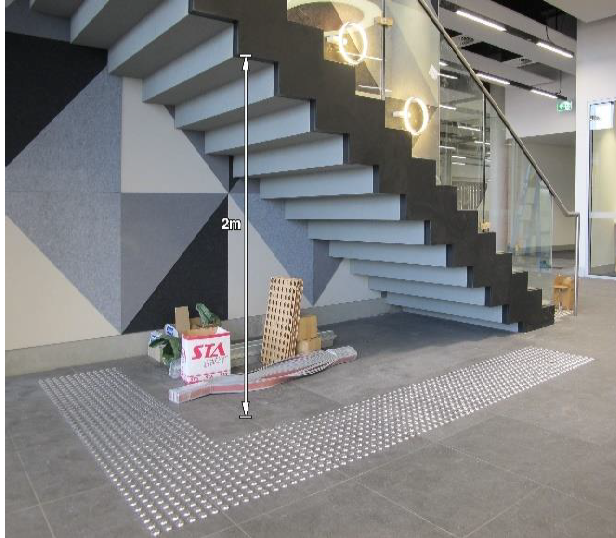 TGSIs installed to provide warning of hazard with height clearance of less than 2.
(Image: Francesca Davenport)
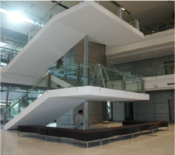 Fixed seating installed as barrier to hazard with height clearance of less than 2m.
(Image: Francesca Davenport)
NOTE
The NCC only applies to the buildings/structures within the allotment boundary. There may be other legislative requirements – for example, warning and directional TGSIs are also applied outside the building line in accordance with AS/NZS 1428.4.1:2009 as/when required by the relevant government or road traffic authorities to guide people who are blind or have low vision to pedestrian crossings and to tram/bus stops.
Handrails
Handrails perform an important navigational and safety function for stairways and ramps. The navigational component is provided by the requirement for handrails to be continuous for the length of the stairway flight or ramp, and where practical around landings. Navigation and safety are provided by handrail placement in conjunction with TGSIs at the top and bottom of a ramp or stairway. Thus, when a person detects a TGSI, they should be able to reach out and find the handrail.
Safety is afforded by creating predictability, adequate warning of changes in surface level, and offering stability during vertical circulation.
Stairway and ramp handrails are required to be provided on both sides (unless it is a fire isolated stairway or ramp); be at an appropriate height of 865 mm – 1000 mm; be provided with extensions beyond the top and bottom of the ramp or stairway. Handrail terminations shall be designed to avoid catching a person’s clothing or causing injury, for example by turning the end of the handrail towards the wall. Handrails are also required to have a 50 mm minimum wall offset and have an elliptical or round profile with a cross-section of 30 mm – 50 mm.
At stairs and ramps where TGSIs cannot be provided or are not required or where handrails are not continuous, domed buttons are required at the top and/or bottom end of the handrails, to warn people who are blind or have low vision that they are approaching a stair or ramp or have reached the end of a stair or ramp.
Applicable NCC clauses and standards:
- NCC 2022 Amendment 2 Volume One Performance Requirements D1P1 Access for people with a disability and D1P2 Safe movement to and within a building. DTS provisions: Clauses D3D22, D4D4(a), I2D4
- AS 1428.1:2021 Sections 8.1, 8.2, and 9
- AS 1428.4.1:2009 Clause 2.4
Layout
In order to provide DTS compliant handrail extensions and TGSIs, stairways and ramps are required to be set back from corridor intersections as well as the allotment boundary. This provision is often overlooked. The required set-back for corridor intersections is one tread depth plus the handrail extension, ie the handrail must not project into the intersecting corridor. Stairways must be set back 900 mm from intersections with the allotment boundary.
Applicable NCC clauses and standards:
- NCC 2022 Amendment 2 Volume One Performance Requirements D1P1 Access for people with a disability and D1P2 Safe movement to and within a building. DTS provisions: Clause D4D4(a), I2D4
- AS 1428.1:2021 Section 8.1
Examples of NCC compliant practice
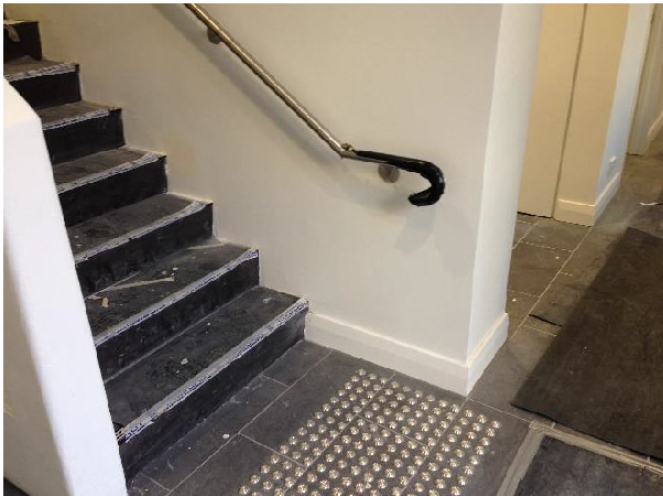 Stairway upgrad: new handrail (with correct extension and temination) that does not protrude into the corridor. Discrete TGSIs contrast with background. (nosings to be completed.)
(Image: Penny Galbraith)
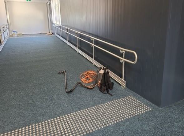 Compliant ramp handrail that does not protrude into the corridor. Discrete TGSIs contrast with background.
(Image: Margarita Rebage)
Stair risers and treads
Stair risers are required to be opaque. No open risers.
Stair treads are required to be slip resistant and be provided with a 30% minimum luminance contrasted nosing strip. The strip must be 50 mm – 75 mm wide, be provided to the full width of the path of travel and must not project beyond the face of the riser.
Applicable NCC clauses and standards:
- NCC 2022 Amendment 2 Volume One Performance Requirements D1P1 Access for people with a disability and D1P2 Safe movement to and within a building. DTS provisions: Clause D4D4(a)
- AS 1428.1:2021 Section 8.1
Note
There are some slight differences for transport buildings covered in Part I2D7.
Examples of non-compliant practice
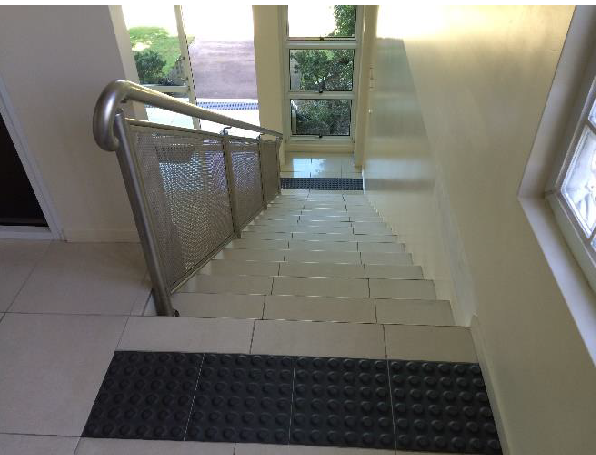 Trip and fall hazard at stairs due to TGSIs located too close to the top riser, inadequate handrail extension and termination, lack of sencond handrail and lack of contrasting nosings (making each step difficult to discern).
(Image: Penny Galbraith)
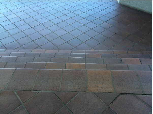 Trip and fall hazard at external steps, which are difficult to see due to lack of luminance contrast, nosings and TGSIs.
(Image: Penny Galbraith)
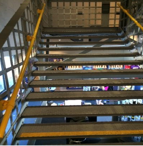 Open risers create visual confusion and contrasting nosing strips are missing on most stair treads.
(Image: Penny Galbraith)
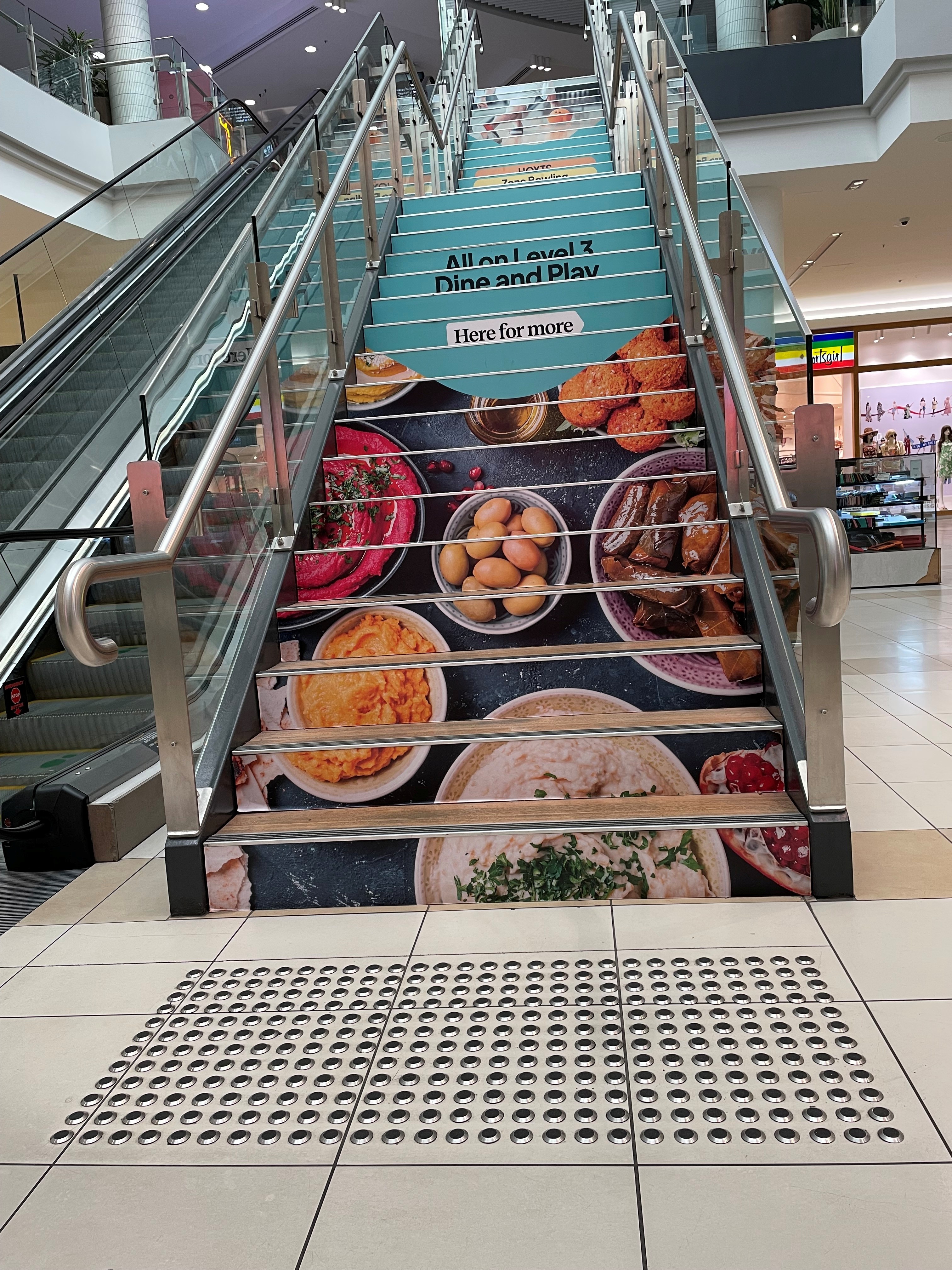 Patterns on risers create visual confusion. (Image: Francesca Davenport)
Example of compliant practice
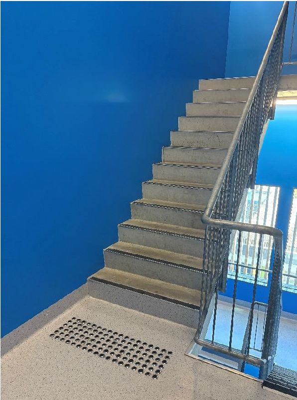 Fire-isolated stairway.
(Image: Penny Galbraith)
Example of best practice
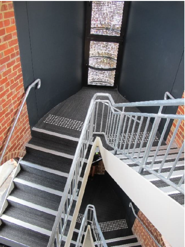 Fire-isolated stairway with handrails on both sides.
(Image: Francesca Davenport)
Lighting
In order to achieve luminance contrast, there needs to be adequate light. The minimum for lift cars generally is 100 lux and for controls 50 lux (AS 1735.12: 1999 clause 10). For buildings generally, designers work to the requirements of AS/NZS 1680.0: 2009 Interior lighting -Safe movement. For transport buildings, NCC 2022 Amendment 2 Clause I2.D12 makes reference to AS1428.2:1992 Clause 19.1, which provides specific maintenance illumination levels for various situations.
Audible information
Lifts are required to provide audible information. For travel more than three floors, audible information is required to be provided in English. For travel up to and including 3 floors an audible tone may be provided.
Applicable NCC clauses and standards:
- NCC 2022 Amendment 2 Volume One Performance Requirements E3P4 Lift access for people with a disability. DTS provisions: Clause E3D8(j).
- AS 1735.12: 1999 Clause 8
Audible signals/alarms/warnings/information in case of fire or other emergencies are especially important to people who are blind or have low vision.
Best practice design solutions
If considered at the outset, best practice does not have to mean more cost.
Layout
A clear layout with a distinct and logical and predictable path of travel, free of obstructions or barriers, aids wayfinding and orientation for all people entering and going through a building. It is especially important to people who are blind or have low vision as many of them rely on shorelining and cognitive spatial mapping.
Shorelining is using the edge of pavements, shop fronts or walls as a guide in navigating the environment. Shorelining techniques include physical contact using the cane, tactile contact using the feet, visual contact, and acoustic feedback. Shorelines, especially along straight lines, help maintain a sense of direction and aid orientation. Curved walls can often create confusion for cognitive mapping of spaces and the acoustic feedback from a curved wall also generates sounds which reflect in ways that can impair their ability to echolocate (ie to interpret reflected sound that bounces off the wall).
Finishes, fixtures and fittings
Texture and colour
Changes in the texture of floor or ground surface materials, which produce an acoustic feedback difference of 3dB minimum, can be aurally detected. Such changes can also produce haptic feedback detectable via a cane or underfoot. Thus, materials contrasting in texture and luminance can be used along the path of travel to indicate a change in the environment, to provide direction or to warn of a change in level - for example, a grass or artificial turf edge to a concrete/asphalt/timber decking path.
As most footwear is dark, lighter flooring has been shown to be preferable for warning people with low vision and other sight conditions about approaching people or crowds (BSI 2022a).
NOTE
There are construction tolerances for abutments of floor and ground finishes and for carpet pile depth. To avoid creating a trip hazard, the difference in slip resistance R value of adjoining floor surfaces, including TGSIs, should not be greater than 2.
Example of Good Luminance Contrast
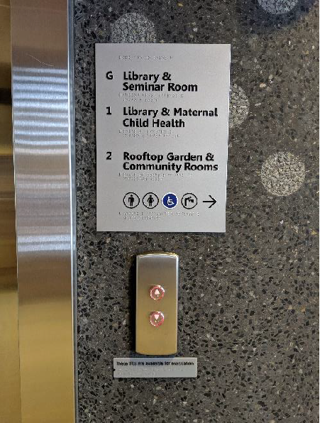
Luminance contrast
In addition to minimum mandated requirements, luminance contrast is useful in identifying door controls, lift controls, switches and the like. It also assists in differentiating planes between, for example, a wall and a floor, particularly if the wall is being used as a shoreline.
Non-mandated signage such as room numbers or names, maps, directional signage etc should all seek to provide good luminance contrast as well as being of adequate size and be positioned at appropriate heights.
Rooms with no luminance contrast between colours of finishes and fixtures become a blur where nothing is distinguishable – for example, a white toilet or washbasin in an all-white ensuite cannot be seen by someone with low vision. Therefore, luminance contrast of 30% minimum between fit-out items such as handwash basins, toilet pans, seats, reception desks, control buttons and their immediate background is necessary to allow identification of these items by people with low vision.
Reflective Surfaces
Avoid high gloss surface finishes that can cause visually confusing reflections. This includes provision of large mirrors in lifts above handrail height. For people with vision impairment, it can give the impression of a person walking towards them. (However, mirrors below the handrail or high on the rear wall may be helpful for people using wheelchairs if they need to reverse out of the lift car).
Applicable standards:
- AS 1428.1:2021
- AS 1428.1:2021 Appendix B (informative) - Measurement of luminance contrast between building elements
- AS/NZS 1428.4.2:2018
Examples of Best Practice Design Solutions
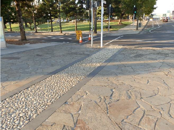 Different textures used on the ground
(Image: Penny Galbraith)
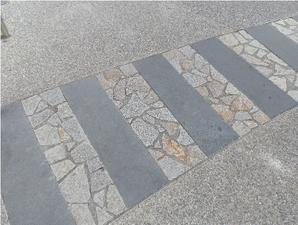 This example provided a different texture and kept surface levels and abutments within acceptable tolerances.
(Image: Penny Galbraith)

Synthetic grass provides colour and texture on surface abutting the timber walkway.(Image: Ria Davenport)
Visual indicators on glazing (decals)
The following best practice design solution has been developed by Access All Ways Consultants to overcome the challenges of varying backgrounds and lighting conditions in meeting the intent and purpose of providing visual indicators on glazing:
A single 75 mm wide white contrasting line as per AS 1428.1:2021 Clause 3.6 bordered by 20 mm wide black solid lines (20B/75W/20B combination) for application when the background is predominantly a light colour (LRV 70 or higher). A reverse combination (20W/75B/20W) of contrasting lines with the same properties is to be applied when the background is predominantly a dark colour (LRV 30 or less). Either combination can be applied when the colour of the background is predominantly mid-range (LRV 30-70).
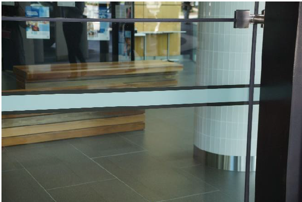 (Image: Bryce Tolliday)
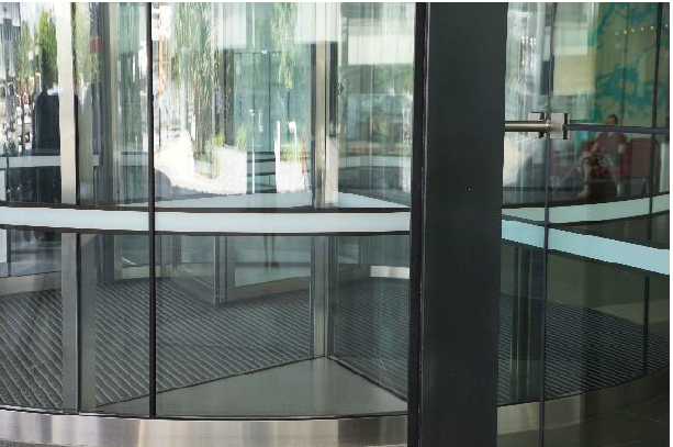
Contrasting strips of not less than 50 mm wide and 30% luminance contrast should be provided:
- On the perimeter of a frameless glazed door within a frameless glazed wall to allow people with low vision to identify the location of the door.
- On the leading edge of a frameless glazed sliding or hinged door within a frameless glazed wall to provide safety for all users from accidental collision with the edge of the door leaf when the door is open.
Example of Recommendation for Best Practice
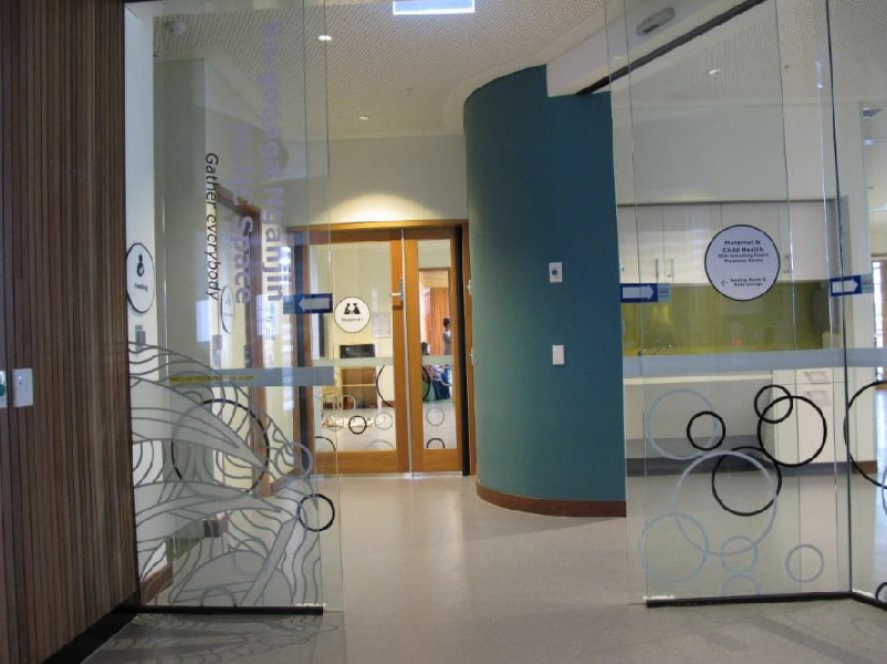 Location of doorway is not clearly defined.
(Image: Francesca Davenport)
Best practice design solution for the frameless glazed sliding doors within the frameless glazed wall shown in the photo, should comprise:
- 20B/75W/20B contrasting strips on the fully glazed walls and sliding doors.
- 50mm wide solid & opaque white contrasting strips on the leading edge of the frameless sliding doors.
Lighting
Light facilitates vision and enables the brain to make sense of surrounding environments. Having low vision makes it difficult to see under typical lighting levels and generally requires a higher illumination (lux level) for people to carry out daily tasks or activities. For example, people over 75 require twice the lighting levels of someone at 45. However, too much light causing glare can also be problematic.
Lighting should not lead to glare or excessive contrast. Consider the placement of windows in relation to a space and the placement of lights in relation to a task. Aim for even distribution of light to avoid patchy lighting and to minimise shadows, which can be visually misinterpreted as a barrier, obstruction or hole in the ground.
Good lighting design for people with a vision impairment will cover general, task and mood lighting to create a pleasant ambience. Consider dimmable lighting solutions, minimising glare, increased natural light, location of lights and selection of light fixtures that emit cool light or have a higher Kelvin, which is better for people with low vision.
Applicable standard and design guide:
- AS/NZS 1680.1–2006
- Acumen note Lighting guide for inclusive design
Glare
The International Commission on Illumination (CIE) defines glare as: 'Visual conditions in which there is excessive contrast or an inappropriate distribution of light sources that disturbs the observer or limits the ability to distinguish details and objects'.
Due to the increase of optical scatter in the eye, the effects of glare are exacerbated for older persons and for individuals with some types of vision impairment (eg cataracts, corneal oedema, and vitreous opacities). Glare causes discomfort and interferes with task performance by decreasing the perceived contrast in visual displays (ie disability glare).
The importance of addressing glare was highlighted by the Order in the Federal Circuit Court case of Ryan vs Sunshine Coast Hospital Health Service (SCHHS), a DDA complaint regarding the Sunshine Coast University Hospital (SCUH).
There is currently no provision in the NCC to reduce or eliminate glare in the built environment. The CIE recommends the unified glare rating (UGR) as a quantitative measure of glare in a given environment, accounting only for interior artificial lights.
The UGR value of maximum 22 in circulation areas and maximum 19 in habitable rooms is recommended; but it shall not exceed 25 for circulation areas and 22 for habitable rooms. Refer to AS/NZS 1680.1-2006 Clause 8.3.3 for the UGR formula.
Daylight Glare Probability (DGP) is a measure of glare from real daylight condition in a side-lit room within the field of view from a certain position, not considering for artificial light. It considers illuminance and luminance from glare sources to estimate the level of dissatisfaction.
The following measures, which include the provisions of ISO 21542:2021 Clause 5.4.7, can assist in preventing glare:
- shielding or shading of light sources, eg by using diffusers
- use of indirect lighting
- appropriate location of the light source in relation to the direction of vision and to the object that is to be observed
- avoid locating windows at the end of corridors where people using the corridors may face the light source
- choosing light colours for ceiling or walls
- not locating light sources within dark surfaces
- in circulation areas, avoid uplighters with light sources at floor or low-level conflicting with the visual field of users
- avoid abrupt transitions from light to dark spaces
- indoor and outdoor lighting levels around entrances and exits should be suitably adjusted to prevent dazzle when entering or leaving a building
- fitting curtains or blinds
- providing tinted low transmission glazing or adjustable opaque louvres at windows
- selection of luminaires that do not produce glare
- select low reflectance (matt or satin) finishes for surfaces
- provide non-glare floor surfaces in areas where there is strong lighting, both artificial and natural.
NOTE
Polished surfaces (eg mirrored surfaces, polished metals such as stainless steel and polished brass) and reflective surfaces increase glare and make it difficult for people who are blind or have low vision, dementia or neurodiversity to navigate – for example, using it on wall surfaces makes it difficult to identify the floor.
Applicable standards:
- AS/NZS 1680.1–2006
- ISO 21542:2021
Visual clarity vs confusion
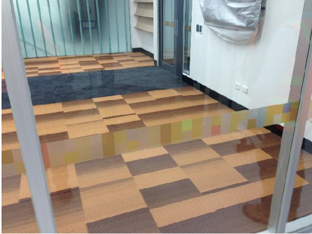
Repetitive high-contrast patterns (Live Science 2025) on the floor surface make it difficult for people with low vision to navigate the room – especially for those with visual processing differences such as cerebral visual impairment (CVI), who may have trouble processing the overwhelming sensory input. The negative effect becomes much worse when the floor incorporates more than one pattern, abuts walls with patterns, and the space has harsh lighting.
The following design details can cause difficulties for people with vision impairments or neurodegenerative conditions (BSI 2022a):
- Blocks or edges of floor surfaces or patterns with high luminance contrast (above 30%) can be interpreted as barriers, a step or a change of level, resulting in confusion and a lack of confidence, which can cause hesitation, overstepping or veering. Note: Do not use flooring material with high luminance contrast to assist in identifying the location of a doorway.
- Floor markings and large patterns with high luminance contrast can be misinterpreted as changes in level, holes or physical objects.
- A shiny floor may appear to be wet or slippery, causing confusion and anxiety.
Design recommendations for floor surfaces (BSI 2022b):
The following patterns and image groups should not be used:
- Geometric and repetitive patterns with high contrast, including patterns that create a visual illusion of holes/openings in the floor.
Examples of repeating geometric forms are stripes, bars, and perforated materials that can appear to shimmer or move when viewed. The effect is relative to the size of the pattern in the field of view, the spatial frequency (number of times the pattern repeats relative to the viewing angle), duty cycle (ratio of shape to space), and contrast (Wilkins 1995). - Complex images containing visual noise hidden within the image (Wilkins, Penacchio and Leonards 2018).
The following patterns should be avoided:
- Large areas of stripes and geometric patterns with high luminance contrast.
- Equally spaced and sized repeating elements of high luminance or chromatic contrast.
- Uncomfortable patterns in three dimensional forms, caused by daylight shading and electric lighting.
- Bold or intense patterns on walkways and stairs where there are risks of falling. Moving across patterns increases the intensity of the effect and leads to loss of balance, change in gait and depth perception.
Patterned floor tiles laid in a format that creates a mosaic effect (eg by rotating alternate tiles) have the potential to cause visual or vestibular disturbance (BSI 2022c). Where the patterns have minimal contrast (below 10 LRV), the configuration of the tiles (eg in chevron pattern or rotated) does not cause these negative effects. (See last two photos.)
Rather than assessing floor plans and interior elevations in isolation, a virtual fly-through during various stages of design would show potential issues and the impact of adjacent floor and wall patterned finishes.
Visual discomfort and use of patterns is a relatively new field for the built environment and techniques for use in the construction industry should be explored further. Until the field becomes developed, creation of concept visuals and virtual modelling with accurately scaled patterns relative to viewpoints should be used to flag potential issues (BSA PAS 2022b).
Examples of floor / wall patterns that should not be used
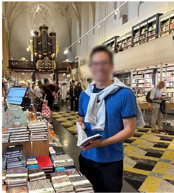 Visual illusion of holes in the floor.
(Image: Budiana Abraham)
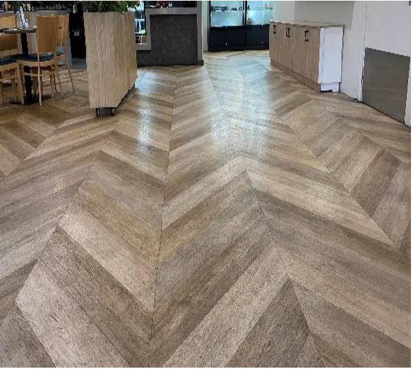 Chevron pattern with luminance contrast above 10 LVR, creates a visual illusion of an undulating floor surface when seen in the direction of the spine.
(Image: Francesca Davenport)
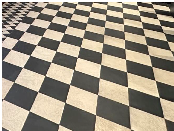
Visual illusion of tilting floor.(Image: Peter Smith, adapted by Francesca Davenport)
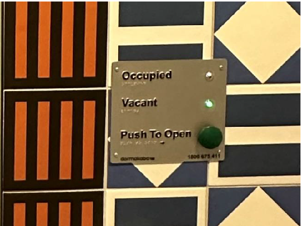 The door control plate is difficult to see due to the bold and busy patterns on the background surface.
(Image: Peter Smith, adapted by Francesca
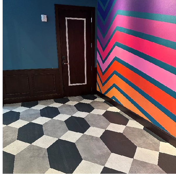 High visual noise; illusion of holes in the floor.
(Image: Arief Abraham)
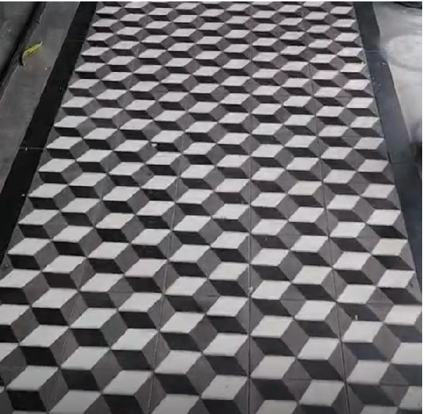 Visual illusion of cubes on the floor.
(Image: Allen Kong)
Example of Floor Surface with Low Contrast Pattern
Floor tiles with low contrast patterns can be laid in any direction without causing visual discomfort or visual illusion.
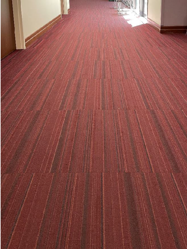 (Image: Francesca Davenport)
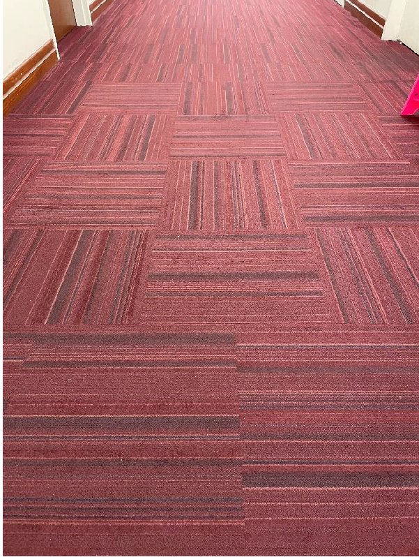 (Image: Francesca Davenport)
Wayfinding design
It is easy to assume that signs and directories are the most effective elements of a wayfinding system. But in a study of orientation in university buildings, it was found that the form of the building (including the number of corridors, the placement of points where a directional choice must be made, and the building symmetry) constituted the strongest predictor of successful wayfinding. The availability of environmental and easily recognised landmarks (plants, artwork, and furniture arrangements, for example) all provide useful information. Instead of moving sequentially from one sign or spot along a path to another with no idea of how it all fits together, moving through a building with a sufficient number of landmarks, views to the outside, and easily differentiated spaces can result in an understanding of the overall building layout and the interrelationship of its constituted spaces (Carpman and Grant).
Wayfinding design should be developed as part of a strategy that includes the continuous accessible path of travel and considers the user experience. Wayfinding design may use a number of design approaches including interior design, signage, maps, finishes (colour and texture), significant visual aids and/or audible aids, artworks and it may use technology.
Design for the first time user. This applies to both wayfinding signage and interior fitout or design. If the wayfinding system works for the first time user, it will work for everyone. Locate related functions, ie those most likely to be used by the first-time visitor on the same visit, close to each other.
Wayfinding signs to assist the orientation of people who are blind or have low vision comprise raised tactile and Braille information signs at building and site entry points, directional signs at decision points and identification signs for rooms and facilities. Keep the wayfinding language as simple as possible. Avoid using long or complicated words eg in a hospital avoid using medical terms which are not commonly or universally understood.
All signage which identifies and provides direction to buildings, rooms and facilities, and signage which lists the names of the building’s occupants (directory) should provide this information in a raised tactile and Braille format.
Tactile room identification signs provide tangible confirmation to people who are blind or have low vision whether or not they have arrived at the correct destination, especially where doors into two adjoining rooms are located adjacent to each other. Therefore, tactile identification signs should be provided to all rooms required to be accessible, including refuges (where people can safely wait for rescue) and to all occupant-operated controls relevant to emergency evacuation.
Consider using room numbering as the raised tactile and Braille identification element in complex facilities where room use will change over time. The room name can change without the need to change the wayfinding element. A good wayfinding signage system will manage change without imposing unnecessary overhead costs each time a change occurs.
Tactile signs with appropriate luminance contrast, font size and symbols also benefit older people and people with a cognitive impairment such as dementia.
Directories, site maps, floor plan maps, and wayfinding signs in raised tactile and Braille format should be located with a consistent link to the continuous accessible path of travel to enable people who are blind or have low vision to find them. For example, consistent placement of all tactile site maps and directory information within approximately two metres of the main entrance and one metre to the left of the continuous accessible path of travel, can create an awareness of where to look for information signage (adapted from Collis E, Peterson I and Tolliday B 1999).
Where tactile signs that are installed at the specified height and location could be temporarily obscured in a crowd, overhead visual signage should also be provided. Reception counters, directory information boards, lifts/escalators/stairs should be located within the sight line of a person entering the building. Primary paths of travel should have a design or finish that differs from secondary paths of travel, eg different colour schemes, lighting or floor surfaces. Significant design elements – such as artwork, fountains, sculptures, plants – can provide useful signposting to assist orientation within an environment.
Applicable standards:
- AS/NZS 1428.4.2:2018 Appendix A (for information on design guidance and a general introduction to wayfinding practices)
- AS/NZS 1428.4.2:2018
Wayfinding technology
Smart wayfinding app-based systems are very useful and should be used to support but not replace accessible wayfinding signage systems within any built environment. These apps provide point to point wayfinding direction and information, eg BindiMaps, and also whole of journey planning is possible where the system is broadly integrated, eg BlindSquare – City of Wellington project NZ. These apps locate users in indoor and outdoor spaces and then provide step-by-step accessible audio directions to their chosen destinations, which might include main entrances, specific rooms in a building, points of interest, bathrooms, and emergency exits.
They also provide contextual information about the users’ surroundings, including features and hazards. Some systems also have the capability to transmit or translate information in various languages. These systems use a variety of technologies to provide localisation in a building. Some require building infrastructure such as low energy Bluetooth beacons or ultra-wide band systems. Some, such as BindiMaps, require no building infrastructure, instead relying on computer vision techniques to create a model of the space and localise a user inside the model. The systems continually update the user’s position and route information as they move. The accuracy of the systems vary – with Beacon-based solutions delivering 1 to 2 m of accuracy and the BindiMaps solution delivering localisation accuracy of around 30 to 50 cm.
The new NaviLens code allows people who are blind or have vision impairment to easily access information on public transport, public transport buildings and public buildings, by using their smart phones.
See NaviLens links here:
- NaviLens
- Yarra Trams
- Independent Shopping for People with Visual Impairments at Tesco with NaviLens Accessible Technology
Further information:
Maintenance, testing and life cycle
Maintenance is a crucial part of keeping a building performing as designed. Clearly communicating the required maintenance and/or anticipated life cycle is crucial to retain required accessibility features. Consider notifying clients of:
- Cleaning regimes – the use of polishing products that change a matt appearance to a shinier one, can change the appearance of flooring. (This was a specific issue with the Ryan case – see below). Ensure that floor surfaces do not become shiny over time.
- Relamping – illuminance levels deteriorate over time (eg fluorescent lamps). This may affect achieving the required illuminance and luminance contrast, and affect safe use of stairs, ramps, ability to read maps, signs and so on.
- Degradation of finishes from use or weathering, for example TGSIs, stair nosings, signage contrast, tactile signs.
- Apps – may require an ongoing subscription and rely on software upgrades.
- Audible announcements and warning systems require to be tested at appropriate intervals.
DDA case – Federal Circuit Court Judgement
Ryan as Personal Representative of the Estate of the Late Peter John Ryan v Sunshine Coast Hospital and Health Service [2021] FCCA 1537.
A recent case heard in the Federal Circuit Court of Australia is particularly relevant to the subject of this Note. The applicant had very low vision and claimed that the design of a new hospital discriminated against him by making unreasonable demands upon him with respect to his independence in wayfinding.
The essence of the applicant’s case was that the building did not meet the Disability (Access to Premises – Buildings) Standards 2010 (“the Premises Standards”) with respect to signage, luminance contrast, and TGSIs and breached the Disability Discrimination Act (Cth) 2001 regarding wayfinding, signage, building finishes and delivery of information.
It was claimed that bright reflective surfaces reduced the applicant’s ability to safely and comfortably navigate through the hospital, identify balustrading, glazing, signage and shorelines, and the absence of luminance contrast between horizontal and vertical surfaces impeded wayfinding and reduced safety.
The Order of 4 August 2021 finds that the respondent contravened particular clauses of the Premises Standards and in so doing breached section 32 of the Disability Discrimination Act.
It should be noted that the intent of incorporating Schedule 1 of the Premises Standards in the NCC was to provide confidence in the building industry that the DDA would be met, in the matters addressed by the NCC, by complying with the Schedule. There are matters beyond the scope of the NCC that are relevant to non-discriminatory design, and some of these came into play in this case as well, but it’s possible that they would not have been of adequate significance to be persuasive on their own.
The issue of the design failing to comply with the NCC was not relevant to the case.
As well as straightforward corrections to meet the Premises Standards, the Order includes provisions to reduce glare in signage (causing extensive replacements), replacing all information, directional and room identification signs throughout the hospital with raised tactile and Braille signs, replacing a stainless steel balustrade with a timber one, painting walls and columns where the walls and floors do not have a 30% luminance contrast, and refinishing all vinyl floors to remove the polished surface and restore original matt finish.
It appears unlikely that the judgement will be appealed.
Details may be found here. The Judgement is entered under the application title HUMAN RIGHTS - Court Events and Orders and is dated 6 July 2021. The Order referenced is dated 4 August 2021.
Acknowledgement
This design note has been prepared by the National Enabling Architecture Committee, Dr Penny Galbraith FAIB FRICS of Galbraith Scott Construction Specialists, Project Managers & Access Consultants and Bryce Tolliday FACA of Access All Ways Consultants.
References
- BSI (2022a) PAS 6463:2022 Design for the mind – Neurodiversity and the built environment – Guide, Sections 12.6.
- BSI (2022b) PAS 6463:2022 Design for the mind – Neurodiversity and the built environment – Guide, Section 12.4.
- BSI (2022c) PAS 6463:2022 Design for the mind – Neurodiversity and the built environment – Guide Section 12.6.3.
- Carpman JR and Grant MA (2016) Design that cares.
- Collis E, Peterson I and Tolliday B (1999) Good Sign Practices
- Live Science (2025), 32 optical illusions and why they trick your mind, Live Science website.
- Wilkins A (1995) Visual stress. Oxford: Oxford University Press.
- Wilkins A, Penacchio O and Leonards U (2018) The built environment and its patterns – a view from the vision sciences. In: Journal of Sustainable Design and Applied Research, 2018, 6(1): 90-95.41).
